Here is the progress of our back cover. This shows the stages we went through when creating it.
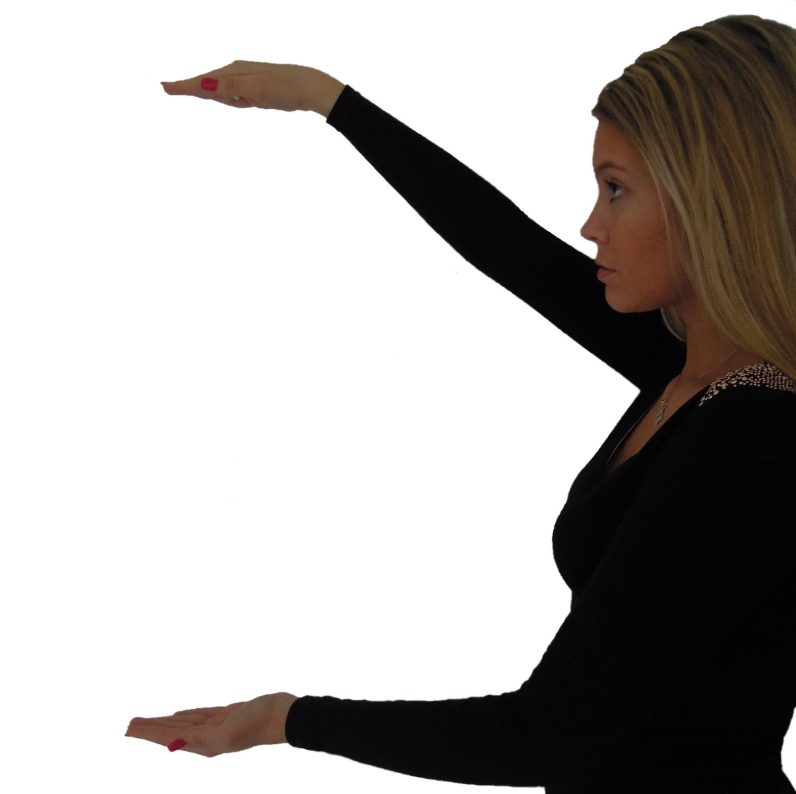
This is the photo we chose to use for our back cover. In one of our lessons we took lots of photos which we will use for our album cover, back cover & poster. We wanted the back cover to look like she was holding the songs in between her hands. However, we have only used the magic wand tool to cut her body out of the background, we have not yet edited it.

This was the next step in creating the back cover. We tested a number of different fonts & colours until we agreed on 'Jellyka - Love and Passion'. We decided to use this particular font because it was the same as the front cover font. We wanted this to be the artists identifier. As photoshop does not many appropriate fonts for our genre, we downloaded several different ones from www.dafont.com. We had a huge choice of styles to choose from, however, this one stood out because of the love hearts around some of the letters.

To ensure the back cover continued to generate interest for the audience, we used star shape stamps in pastel colours so it didn't take attention away from the writing & photograph. To do this, we downloaded brushes from www.brusheezy.com. They had a large variety of different brushes compatible with photoshop. We downloaded approximately 10 sets of brushes to test out on our back cover.

This is our most updated version of our back cover. We decided to change the stars as we thought they looked insignificant & they did not reflect the attitudes that the song portrays. That is why we chose to use flowers & butterflies instead because they represent freedom & nature more effectively. We still thought they pastel colours suited the theme of the whole album, which is why we did not change them.
No comments:
Post a Comment