Wednesday, 25 January 2012
Template Problems
After making several drafts for our album cover & back cover, we have almost finished & are making final tweaks. However, a huge problem we have encountered is that we must put them on a template, which needs to be a certain size. As our media teacher did not tell us about the covers needing to be a certain size, we have needed to spend hours trying to re-size them so they would fit the template properly. This has been our main priority over the last few lessons & has meant alot of time has been wasted on a simple error that could of been avoided at the start. Thanks to Jack (the IT technician), we have managed to get them to correct size & not pixilated, which was a problem we encountered ealier on.
Editing Photo
As we had problem with the sizing of the front cover, we had to use the original photo that we had previously cropped to cut out the bottom to save us having to clone out the date. However as we needed the cover to be longer, I spent time cloning out the date from the image using Adobe Photoshop.
Here is the original photo

This is the image without the date, after using the clone stamp tool

I then used the quick select tool in Photoshop to pick up the subject, I then right clicked and clicked 'layer via cut' which put my subject into a new layer with no background image. After this I used the rubber tool to get rid of any bumps that were on the edge of the subject.

Sunday, 22 January 2012
Back Cover
Here is the progress of our back cover. This shows the stages we went through when creating it.
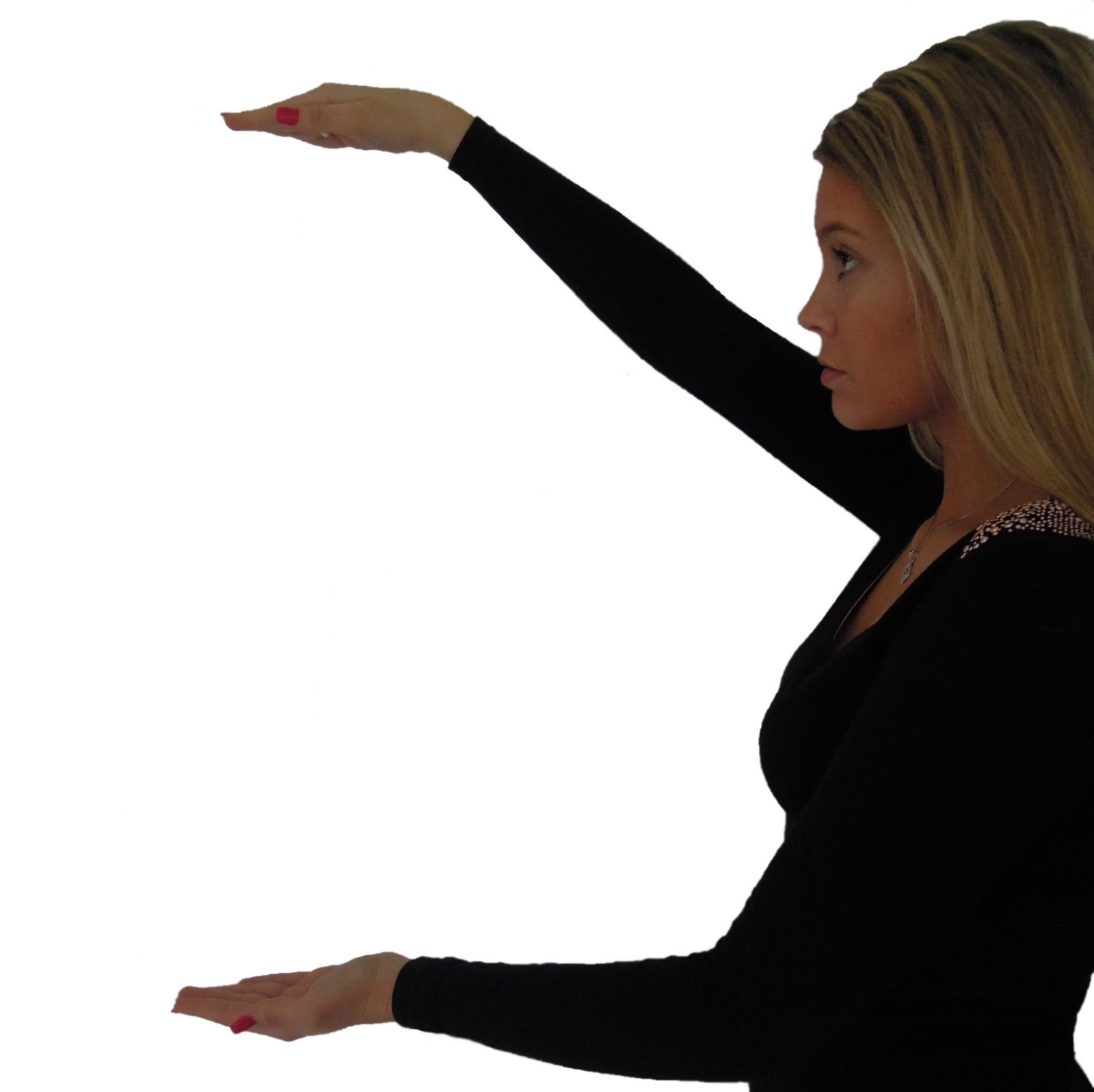
This is the photo we chose to use for our back cover. In one of our lessons we took lots of photos which we will use for our album cover, back cover & poster. We wanted the back cover to look like she was holding the songs in between her hands. However, we have only used the magic wand tool to cut her body out of the background, we have not yet edited it.

This was the next step in creating the back cover. We tested a number of different fonts & colours until we agreed on 'Jellyka - Love and Passion'. We decided to use this particular font because it was the same as the front cover font. We wanted this to be the artists identifier. As photoshop does not many appropriate fonts for our genre, we downloaded several different ones from www.dafont.com. We had a huge choice of styles to choose from, however, this one stood out because of the love hearts around some of the letters.

To ensure the back cover continued to generate interest for the audience, we used star shape stamps in pastel colours so it didn't take attention away from the writing & photograph. To do this, we downloaded brushes from www.brusheezy.com. They had a large variety of different brushes compatible with photoshop. We downloaded approximately 10 sets of brushes to test out on our back cover.

This is our most updated version of our back cover. We decided to change the stars as we thought they looked insignificant & they did not reflect the attitudes that the song portrays. That is why we chose to use flowers & butterflies instead because they represent freedom & nature more effectively. We still thought they pastel colours suited the theme of the whole album, which is why we did not change them.
Friday, 20 January 2012


Little Problems with Timings and Lip Syncing
Although I have watched the music video many times, after watching the second draft on youtube last night I noticed a few little things that are out of time. One of these was when she is walking towards the camera singing "because it's too much" at 00.00.39.21, I noticed the lip syncing was not completely in time. To correct the lip syncing I took out the first frame and dragged the clip back and lengthened it by one frame.
I also noticed that the lip syncing was not right on the line "to be something I'm not" at 00.00.34.18, and also the quality of the image was not brilliant because we had zoomed in. To correct it I took out the first 2 frames and dragged it back and lengthened it by 2 frames, this lined the lip syncing up and looked much better. I then zoomed out the clip which improved the quality.
I also noticed that the lip syncing was not right on the line "to be something I'm not" at 00.00.34.18, and also the quality of the image was not brilliant because we had zoomed in. To correct it I took out the first 2 frames and dragged it back and lengthened it by 2 frames, this lined the lip syncing up and looked much better. I then zoomed out the clip which improved the quality.
Album Cover Copies
Over the last few lessons we have been continuing to improve our front album cover. Here are some of the alternative album cover choices which we chose not to use for our final piece as well as our general progress:


This was the first album cover design we created. Although we really like this album cover & considered submitting it for our final piece, we decided we wanted identical costume, hair & makeup for the front & back cover. As we did not have a suitable picture for the back cover to match the front, & this picture matched a shot in our music video, we decided not to use it & to continue creating a different album cover.

This is the first draft of our new album cover design. Clearly, this was a working progress as the date had not been cloned out yet & the picture had not been colour corrected. We chose to use this font & colour as it represents femininity due to the hearts & the colour pink.

This is an extension of the previous draft. We added a pale blue gradient, as well as some stamps to make it appeal to our target audience.

This is the most recent draft of our album cover. We still need to make adjustments, e.g. add the album name 'The Show', as well as take out the date & colour correct the photo. We also moved the gradient to the top of the page to look like sky. We are happy with the overall layout & will continue to make improvements.
Thursday, 19 January 2012
My Feedback for Album Cover
Ella and Georgia have been the ones that are having most input with the making of the album cover and magazine advert, I have been concentrating on making sure the editing is flowing and all timing are right and correcting anything that needs to be changed. However I have been giving my feedback on the album cover, after looking at the back cover, I thought that the text was too low down so suggested that it got moved to the left a bit and moved up to ensure it was in the middle of her hands (as if it was floating), this caused the bottom to be a bit empty so I suggested that another butterfly should be added to the bottom right to help even out the top to the bottom.
Still Shots
Yesterday (Wednesday 18th January) we went to Georgia's house to take some still shots for our album covers and magazine cover.
It took just over 2 hours and we took about 50 photographs. We are happy with the shots we got and think they will look good once it is all is finished.
It took just over 2 hours and we took about 50 photographs. We are happy with the shots we got and think they will look good once it is all is finished.
Feedback on our second draft
We have uploaded the second draft to You Tube for family and friends to look at it and give us any relevent feedback.
Overall the majority of the feedback received was positive, they were very impressed with the quality of our work.
The points they gave were:
Overall the majority of the feedback received was positive, they were very impressed with the quality of our work.
The points they gave were:
- stop motion with bench and heart post-it notes are done well
- the different locations and costumes show how much work has gone into it
- although the split screen isnt perfect they thought it looked very good
- it makes them want to watch the full completed version
- lip syncing was of a high standard
- lighting is very good and natural looking
- some shots were too long, of performer just singing.
Tuesday, 17 January 2012
Feedback On Our Most Recent Rough Cut
We recently got feedback for our video from our media class. This was a very helpful task as it allowed us to see what others really thought & ways that we could improve the video as well as the things they liked. These were the main points which were given to us by our class:
- Some lip syncing was off but mostly really good with split screen
- Good effects, enjoyed it
- Less of the squirrel shot
- Stop motion was really good
- Really liked the stop motion & the split screen. The locations were good & fitted well with the song
- Favourite part was the 'I Want My Money Back' bit (split screens)
- Do more relating visuals to lyrics
- Really good ideas, loved the beginning shot
- Fantastic, have managed to capture a constant atmosphere so far through the film & cover, keep it up with rest of the editing
- Excellent camera work, covers need developing & advert magazine needed, play with fonts.
Overall, people enjoyed the stop motion & split screens most. A lot of comments suggested we shortened the squirrel shot which we have now done. This feedback has been extremely useful & we intend to gather more feedback from others to help our video improve to the highest standard.
Album Cover Drafts


This is the first & second draft of our album cover. You can see how we progressed & improved it by changing the font, however, we do not like the bricks as a background as it is proving difficult to use a font which stands out & compliments the photo so we will continue to try out different ideas.
Thursday, 12 January 2012
Magazine Poster

This was the first magazine poster we created. We wanted to test out different background gradients, photographs & fonts. We did not like this first draft as we thought it looked amateur. We believe we have the skill & ability to create something a lot better which is why we started a completely new poster.

This was created as we wanted to test fading in gradients from the bottom & top of the screen. We also decided on using this font, as we wanted it to be her signature font, so she is easily recognisable. However, we thought the colour scheme was too dark & portrayed negativity which is not what our artist represents.

This is our most recent draft of the magazine poster. Changing the colour scheme to pink & grey enabled our album cover & poster to be cohesive in their style. By using five small pictures of our artist rather than a large photo which looked artificial & out of place. However, the small five photos allow her to show her personality & it fitted more naturally on the page.
Wednesday, 11 January 2012
Problems with Final Cut
We have noticed that we we input some new footage into our timeline. that our work which is at the end of the time line is moving, this is causing problems when editing and changing the timing of the shots. We will have to lock certain tracks to ensure it does not happen again because we are wasting time when correcting.
Editing Progress
We have been editing for a while now and can defiantly see how our music video is progressing. We are very happy with how it is going however we know it still has a long way to go.
Yesterday I exported a new version which I will upload to YouTube.
By having different versions, it will show how we have progressed throughout this project.
Yesterday I exported a new version which I will upload to YouTube.
By having different versions, it will show how we have progressed throughout this project.
Subscribe to:
Comments (Atom)